Why Canva is the best tool for Teacher Slide Decks
Friday 14th August 2026
Introduction
Ever since I began crafting lessons for secondary pupils, I have been searching for the perfect presentation tool. In a computing, mathematics or any classroom, a slide deck is far more than just a sequence of bullet points. It functions as the visual backbone of the lesson. It guides explanations, models concepts, and keeps pupils engaged.
I conducted an extensive experiment to evaluate presentation tools specifically tailored for teaching. The goal was simple: to assess which of these solutions would be most genuinely useful for creating my lesson slides. This evaluation was driven by practical, everyday utility and essential features, rather than mere aesthetic appeal.
Methodology
The first step was to determine which software platforms to explore. I made the decision early on to exclusively test web-based cloud software, eliminating any hardware limitations or installation hurdles. Relying on web-based platforms afforded several non-negotiable features for a busy teacher:
- Automatic backups on the platform
- Frictionless sharing
- Seamless editing across multiple devices
- No hardware limitations
My school operated within the Google ecosystem. This meant my baseline at the start of the year was Google Slides, which I had been using prior to this experiment. Many teaching resources circulate as PowerPoint files, but I found it incredibly easy to import and adapt them into Google Workspace. Google Slides inherently provided all the cloud benefits I required, and as such, it served as the perfect control variable for this experiment.
A Year-Group Breakdown
To thoroughly road-test each platform, I assigned a different presentation software to each year group, allowing me to explore their capabilities simultaneously across varied topics:
| Year Group | Topic / Unit | Software |
|---|---|---|
| Year 7 | Spreadsheets | Canva |
| Year 8 | Python Turtle | Pitch |
| Year 9 | Illustrator | Visme |
| Year 11 | GCSE Computer Science | Google Slides |
| Year 11 | iMedia | Prezi |
| Year 11 | Faculty Interventions | Adobe Express |
This allowed me to effectively test each presentation platform, without remaking the same slide deck in each tool every for every lesson, which would be a significantly different undertaking and workload.
There were a handful of platforms I intentionally excluded from this experiment, including Mentimeter, Genially, Piktochart, Figma, and Powtoon. This exclusion largely resulted from limited feature sets, overly niche use cases, or restrictive paid tiers. I also excluded online whiteboarding tools, despite many of them having built in presentation features, as those serve an entirely different pedagogical purpose, but I will be discussing those tools another time.
The Evaluation Criteria
Using my extensive experience in resource creation, I developed a strict set of requirements to score each piece of software. I divided these into two distinct categories to capture the full lifecycle of a lesson. Here is why each metric is critical in a classroom environment:
Making Presentations
- The Design Tools: Teachers need to build complex diagrams, align text, and construct equations quickly. Robust design tools save hours of preparation time.
- Animations: In an educational setting, animations are not about flashy effects. They are essential for cognitive load management. Being able to reveal answers step-by-step keeps pupils focused on the current instruction.
- Morph (or similar): Smooth transitions that map objects from one slide to the next are phenomenal for modelling processes, such as mathematical transformations or the flow of data in computing algorithms.
- Ease of Use: Teachers are notoriously time-poor. The software must be intuitive enough to allow rapid creation without wrestling with complex menus.
- Library of Assets: Having high-quality icons, shapes, and stock images built directly into the platform prevents the constant need to search the web for external visual aids.
- Importing PPTX Resources: Teachers rarely start from scratch. The ability to seamlessly import and adapt existing PowerPoint (.pptx) files without completely destroying the original formatting is a massive time-saver.
- Sharing Resources: Teachers rarely work in isolation. The ability to seamlessly generate collaborative editing links for departmental colleagues, or easily distribute slide decks, view-only links and LMS-integrated assignments, is essential for a frictionless workflow.
Presenting Presentations
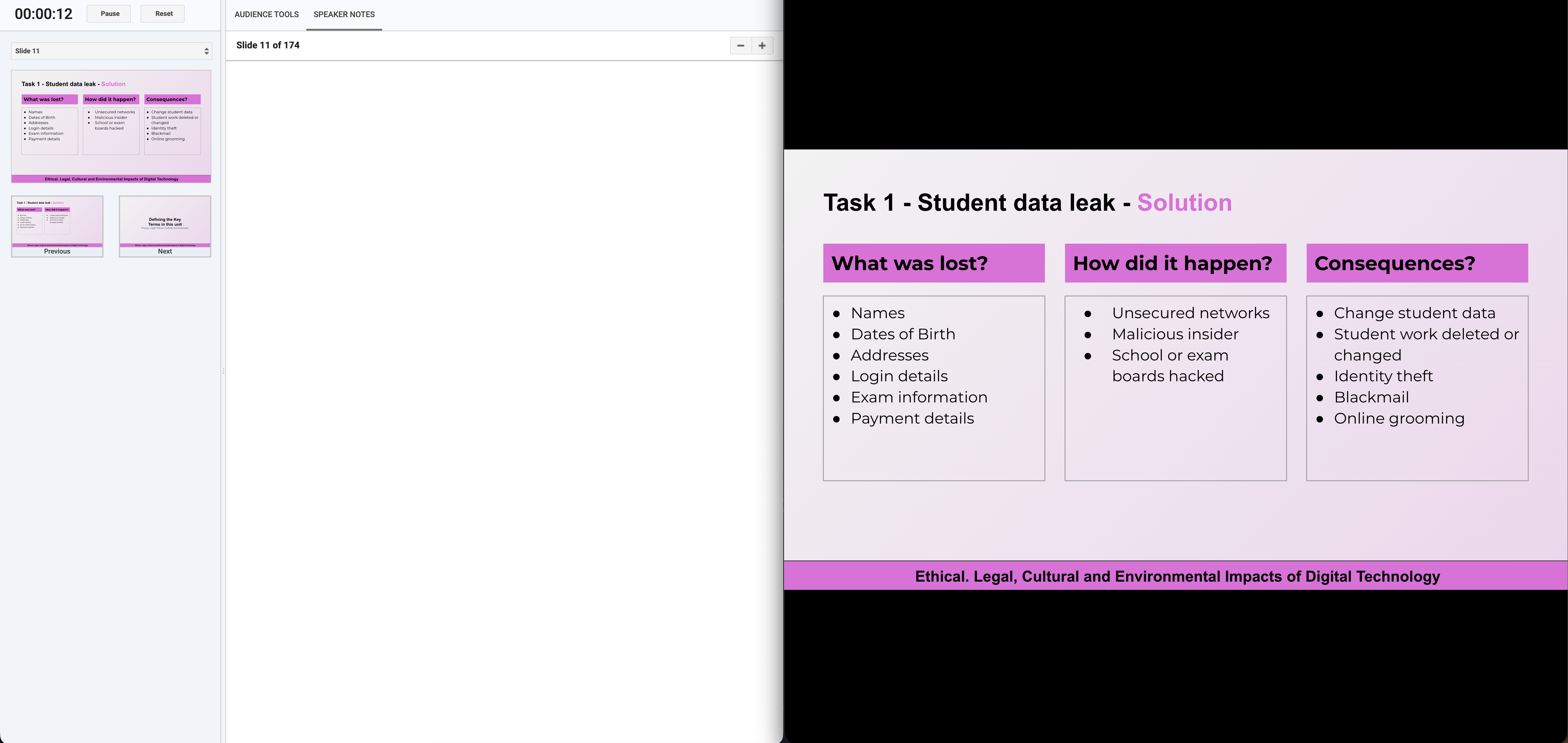
- Speaker View: A dedicated dashboard for the teacher on their monitor is vital for keeping track of time and pacing the lesson effectively.
- Speaker Notes: These act as essential scaffolding. They allow teachers to script out key questioning prompts or differentiation strategies that remain hidden from the pupils on the main board.
- Live Updates from Drawing: This is arguably the most crucial feature for STEM subjects. The ability to annotate live over a slide from a tablet, whilst roaming the classroom, transforms a static presentation into an interactive modelling tool.
- A Next Slide Preview: Knowing exactly what is coming next allows for seamless verbal transitions between concepts.
- Built-in Timer: Time management is vital for classroom pacing. A native, on-screen timer keeps pupils on task during independent work without requiring the teacher to open separate browser tabs.
- Additional Presenting Features: Built-in tools like random name pickers, live pupil polling, or analytics elevate standard presentations into highly interactive classroom experiences.
What do others say about these tools?
Before drawing my own conclusions, I reviewed how the wider community evaluates presentation softwares. The general consensus across technology and education platforms highlights that no single tool is perfect for every scenario, but distinct leaders emerge based on their specialities.
Reviewers frequently note that standard tools like Google Slides and PowerPoint remain dominant for straightforward team collaboration and widespread familiarity. However, platforms like Canva are praised for having one of the broadest template and visual-asset ecosystems available, making them incredibly beginner-friendly for non-designers.
Prezi is consistently recognised for its non-linear, zooming canvas, which is highly effective for storytelling and showing the relationship between broad concepts. Meanwhile, tools like Visme are celebrated for their data visualisation capabilities and interactive charts, and Adobe Express is highlighted for combining presentation design with strong multimedia and branding templates.
Ultimately, the best presentation apps share common traits. They offer professional pre-built templates, seamless sharing options, deep customisation flexibility, and affordability. For educators, the choice often hinges on balancing rich visual capabilities with the practicalities of live classroom delivery.
Insights
I maintained a week-by-week journal to record my immediate thoughts as I deployed these tools live in the classroom. This experiment truly became a journey of discovery.
Week 1: The Initial Impressions
What an interesting week! Designing slides in different web apps makes a sometimes quite long task a lot more exciting. The standouts are Visme and Canva, proving to have intuitive interfaces, lovely animations, and plenty of opportunities for creativity. I found Google Slides quite lacklustre in comparison, although the animation sequencing is undeniably a lot easier to manage. Pitch proved the least exciting in my opinion. Although the slides looked nice, tidy, and pleasant, they lacked that creative flair that I discovered with Visme and Canva.
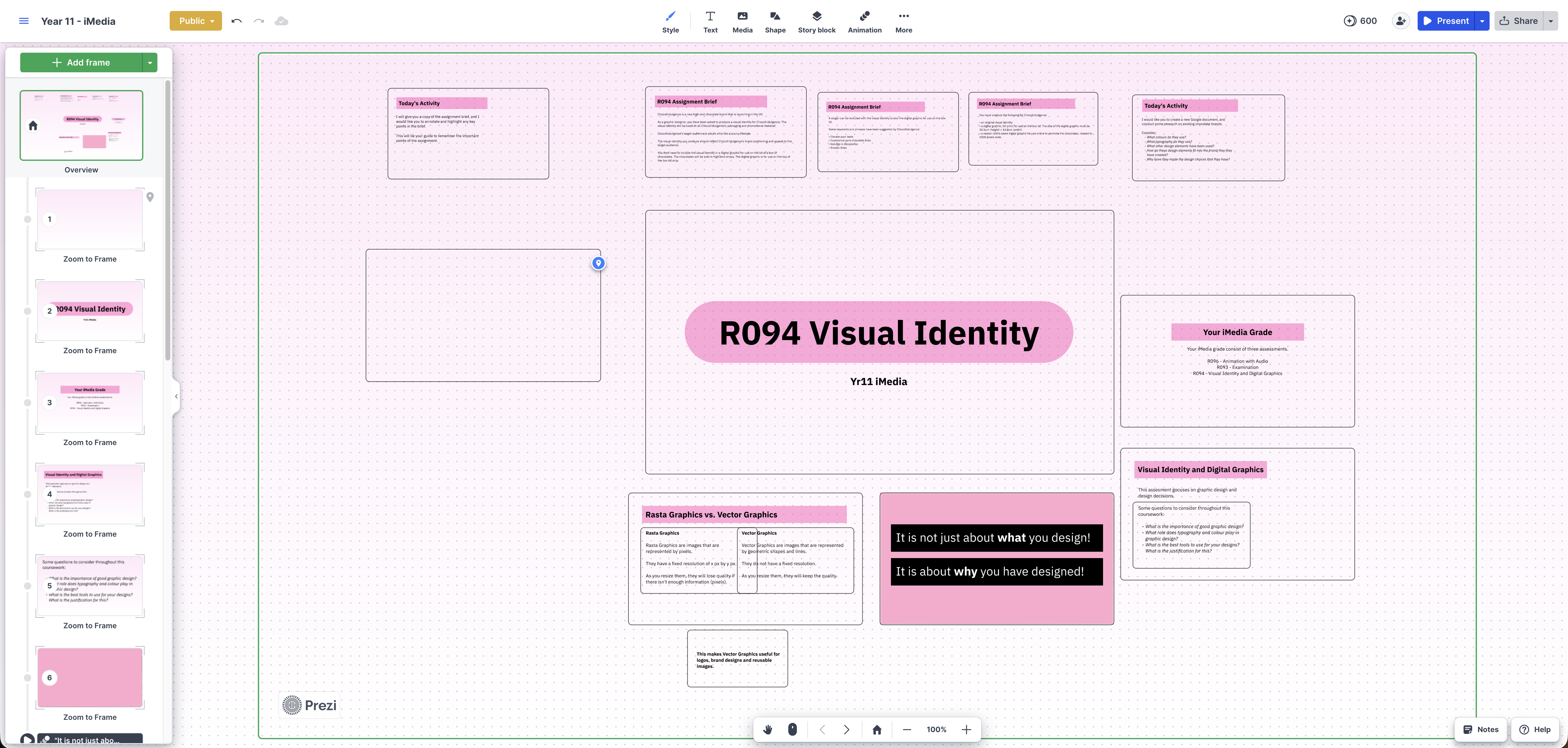
Prezi proved the most challenging to get started with. It is distinctly different from the other platforms I am testing, and different to any other presentation software I have used. It is based on a large canvas, using frames and moving around those frames instead of typical slide animations. Although challenging, I eventually got my slides created, but the result was lacking a lot of the stylistic polish I was able to achieve with other applications.
Week 2: Pupil Reception and Engagement
By the second week, the impact on learning became evident. A pupil specifically praised the clarity and animations on the Visme presentation, noting that they made the delivery much more exciting without becoming a distraction. This feedback validated my belief that visual design impacts pupil engagement. Canva also received positive reactions from Year 7, particularly due to the vibrant graphics and integrated icons that helped clarify the spreadsheet concepts. Conversely, my Year 8s found the Pitch presentations slightly corporate and dry. It became clear that while clean design is helpful, younger pupils benefit from more visually stimulating educational assets.
Week 3: Navigating Structure and Flow
This week tested my patience with structural layouts. While Adobe Express offered brilliant multimedia integration, manipulating text and content heavy slides felt slightly clunky compared to a dedicated presentation builder. Meanwhile, I found myself wrestling with Prezi’s spatial canvas during my iMedia lessons. Trying to map out a clear, linear sequence for exam preparation on an infinite canvas was frustrating. It is a fantastic tool for big picture concepts, but for step-by-step procedural teaching, it was challenging at times. Google Slides, for all its visual simplicity, remained the most reliable for quickly structuring a traditional, logical lesson flow.
Week 4: The Presentation Experience
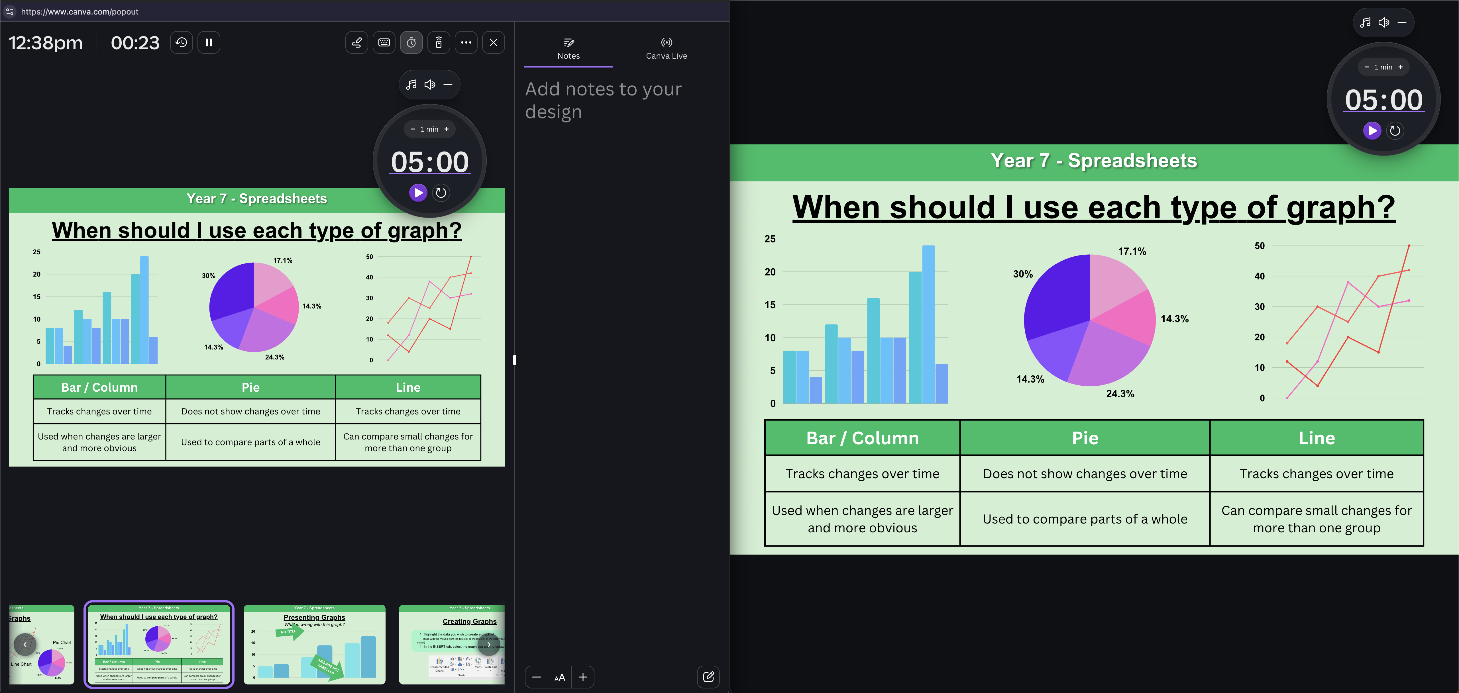
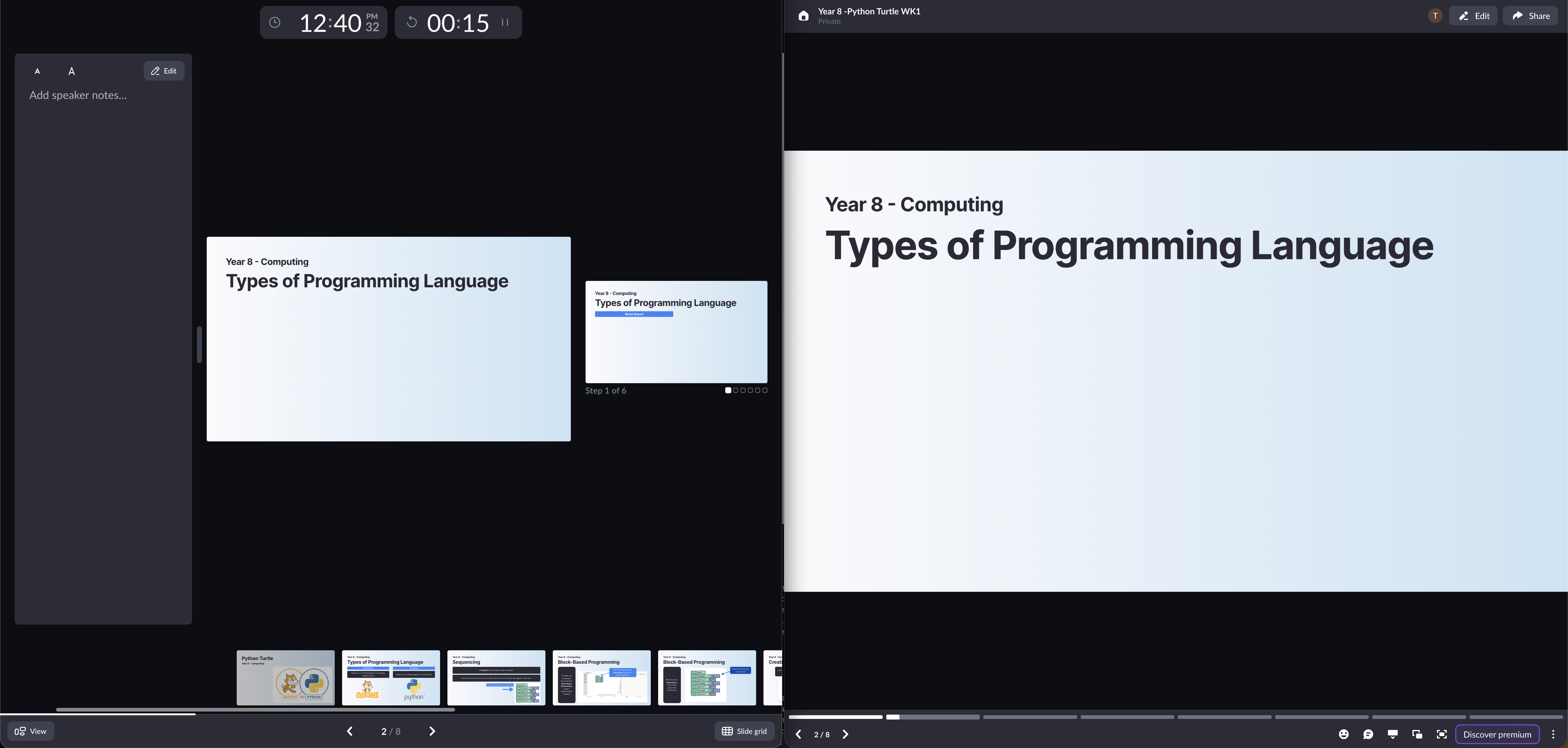
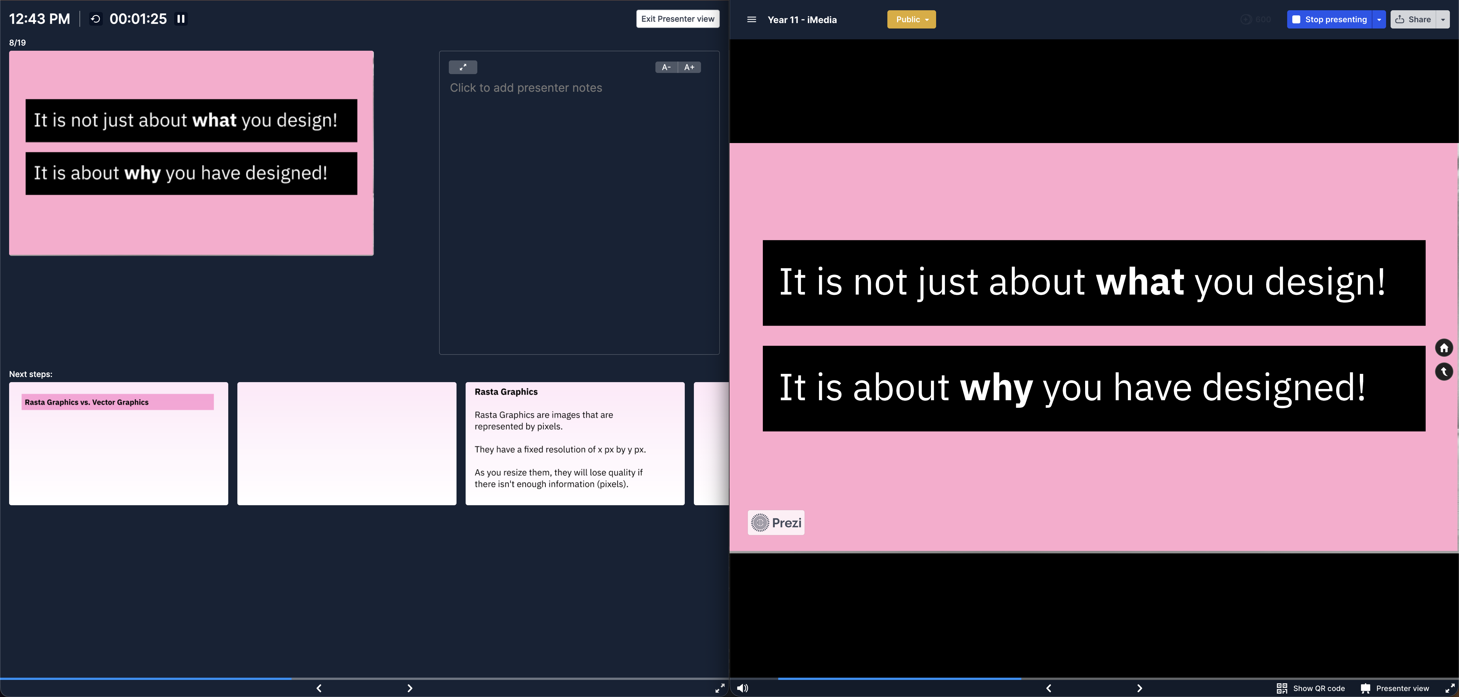
Week 4 was entirely focused on the actual experience of presenting at the front of the room. I spent time digging into the presenter views of each platform. Prezi and Pitch offer solid presenter displays, showing my speaker notes and a clear preview of the upcoming slide. Adobe Express also surprised me with a very clean presentation mode. Canva’s presentation mode was fantastic as well, but went beyond expectations with the integrated timer feature inside the presenter, which made controlling lesson activities a breeze.
Week 5: Live Delivery and Annotation
This week highlighted the most significant gap between standard presentation software and true educational tools. Teaching often requires live, on the fly modelling. With Google Slides, Visme, and Pitch, my ability to draw over the slides in real time was severely limited or non existent. I found myself having to annotate seperately (on a different whiteboard) to the slides which muddled the flow of the lesson. Canva, however, allowed me to annotate directly onto the slides from my tablet, with those annotations updating instantly on the projector. This single feature completely transformed my live delivery, allowing me to highlight and annotate content without breaking the flow of the lesson.
Week 6: The Final Verdict
As the experiment concluded, I spent the week reflecting on the overall workflows. Pitch and Visme produced beautiful results but felt better suited to business boardrooms or marketing departments. Adobe Express is a creative powerhouse, but perhaps better suited to pupil projects than daily teacher slide generation. Prezi is visually unique but demands too much cognitive effort to structure a daily lesson. Ultimately, it came down to a battle between the reliable simplicity of Google Slides and the expansive ecosystem of Canva.
Example Presentations
Below is a detailed look at the resources generated during this six week experiment, evaluating how each platform held up to the standards of my daily teaching schedule.
Google Slides
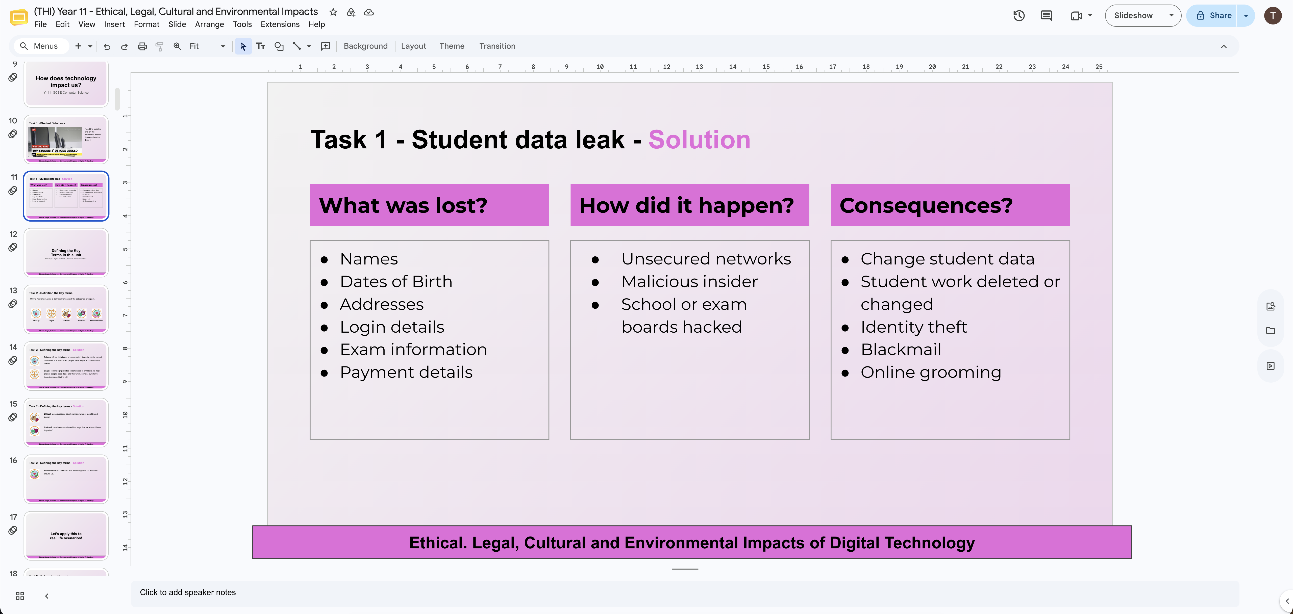
As the control for my experiment, Google Slides was deployed for my Year 11 GCSE Computer Science lessons. Its primary advantage is absolute reliability and seamless integration with the Google Workspace we already use at school. Structuring the logical, linear flow needed for exam theory was incredibly straightforward. However, the major disadvantage quickly became apparent during live delivery. The platform lacks the modern graphic assets and animation capabilities to truly capture attention. Furthermore, when trying to model examples, the inability to easily live draw over slides forced me out of my presentation flow. It is functional, but creatively lacklustre.
Canva
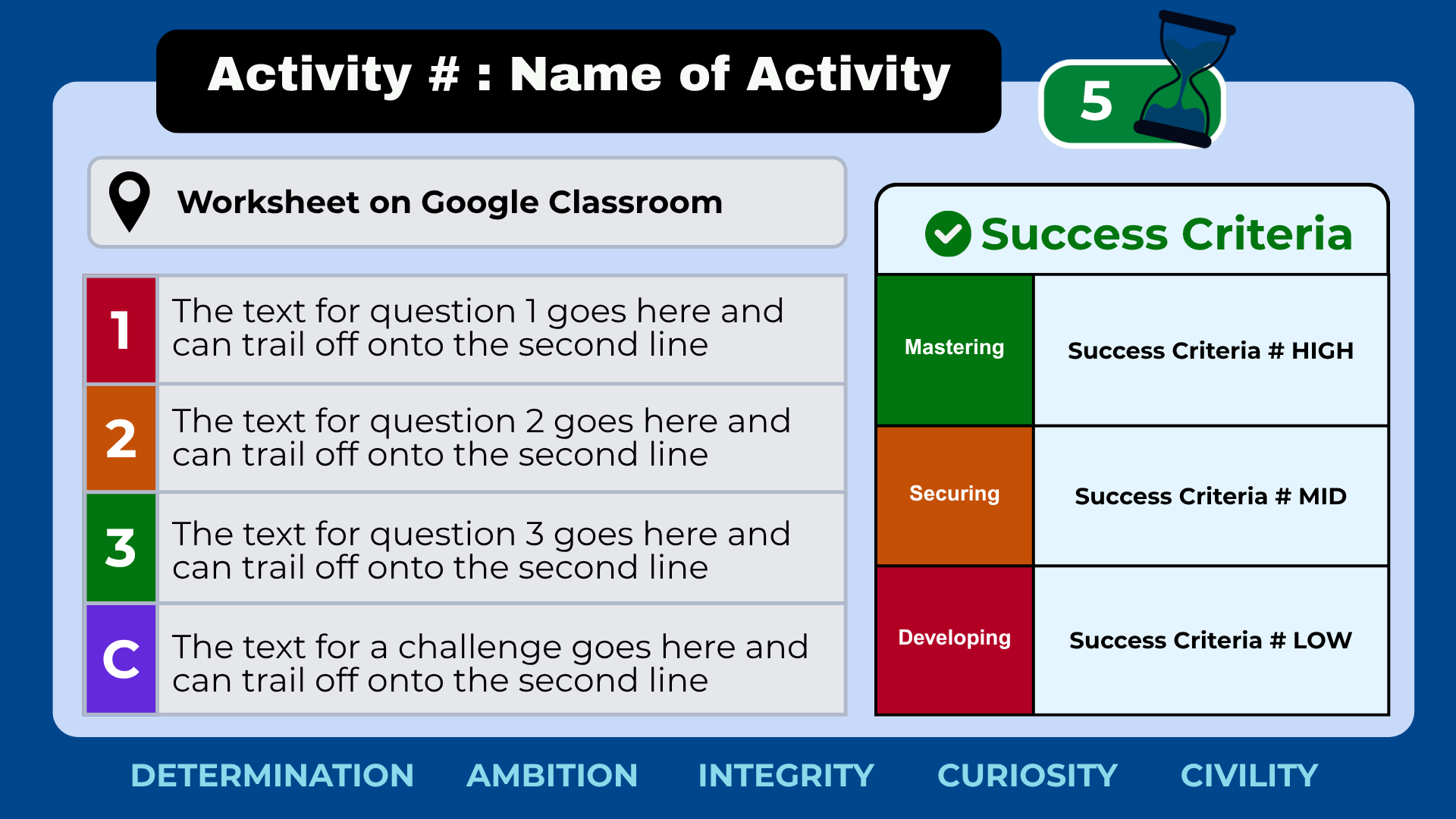
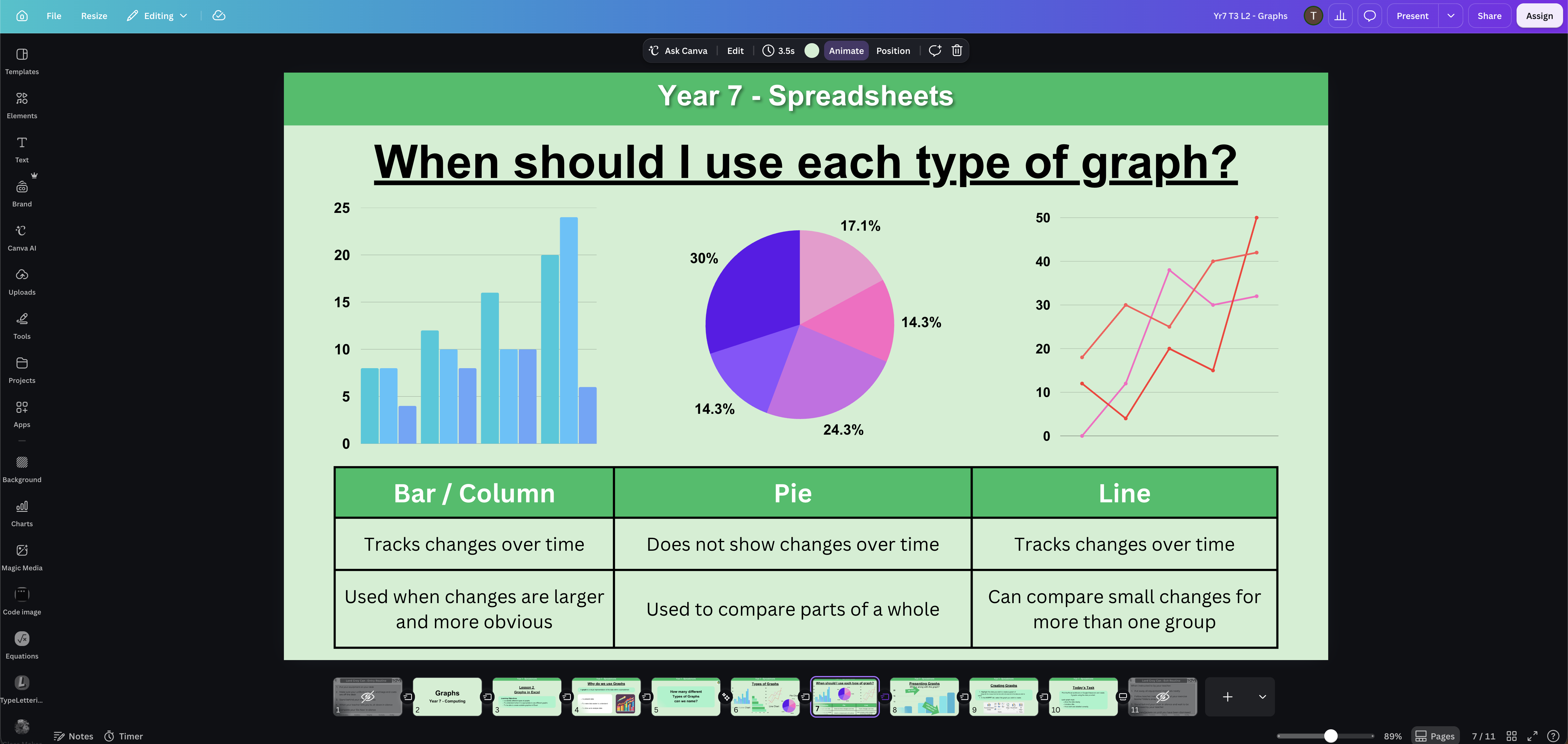
I assigned Canva to my Year 7 Spreadsheets unit, and it fundamentally shifted how I approach lesson design. Its greatest advantage is the sheer volume of high quality, built in assets, which instantly made building spreadsheets in the slides easy. Crucially, Canva introduced a new way of teaching. It allowed me to roam the classroom with a tablet, annotating directly over the slides, with those drawings updating instantly on the main projector. This made live modelling entirely frictionless. While the interface can sometimes feel slightly crowded due to the vast array of features, the inclusion of smooth Morph transitions, comprehensive speaker tools and the built-in timer makes it an unparalleled ecosystem for modern teaching.
Visme
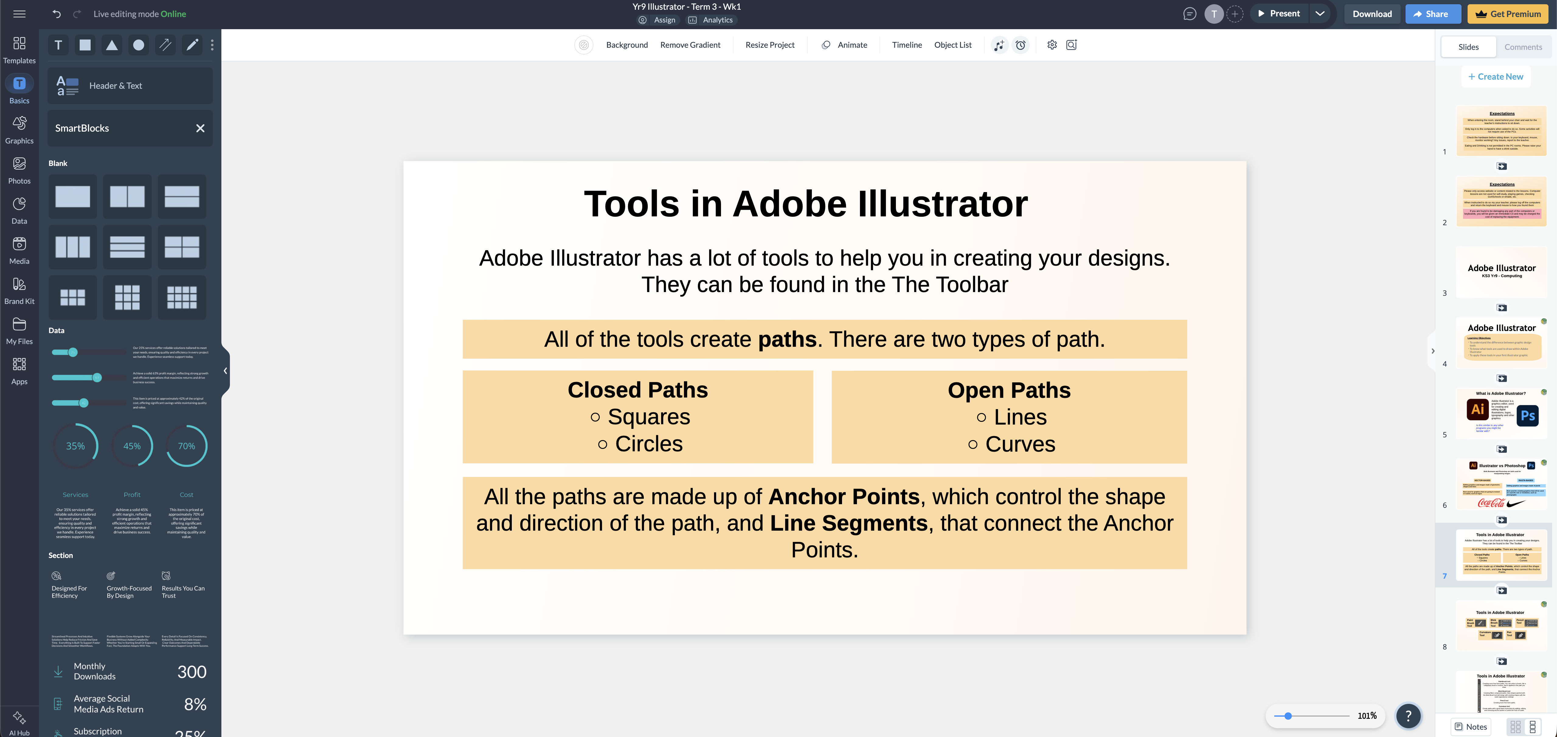
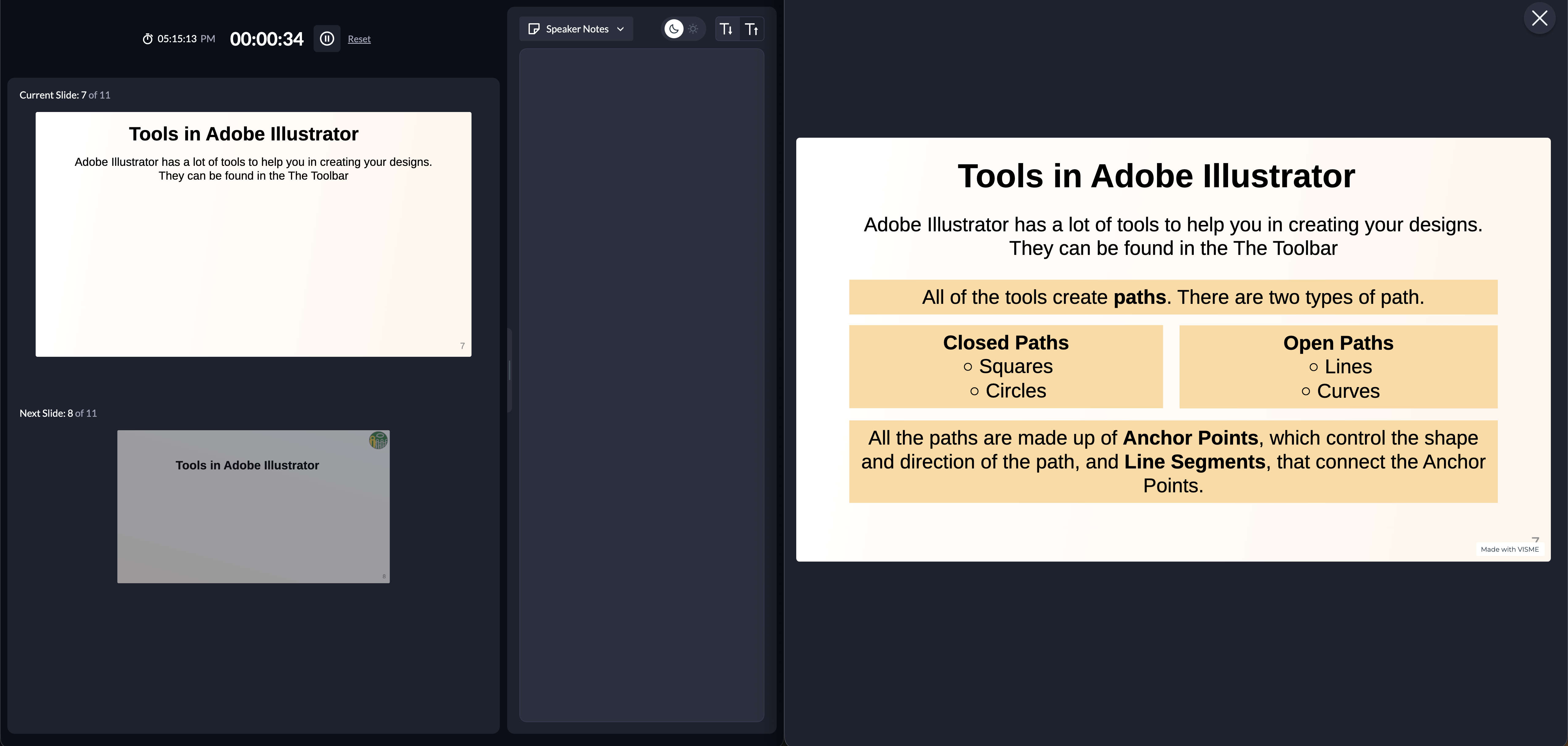
Testing Visme with my Year 9 Illustrator class was a highly engaging experience. Although I didn’t get to test it’s capabilities much, a massive advantage of this platform is its advanced interactive charts and data visualisation widgets, which are far beyond what standard presentation tools offer. However, these features are unlikely to be used much in day-to-day teaching but would be immensely useful for presenting to other staff. The animations were smooth and elicited genuine praise from the pupils, helping to break down graphic design concepts procedurally without becoming a distraction. The disadvantage, however, lies in its live teaching limitations. Like Google Slides, it lacked the integrated live annotation tools I appreciated for on the fly modelling, and many of its best interactive features are locked behind premium business tiers.
Pitch
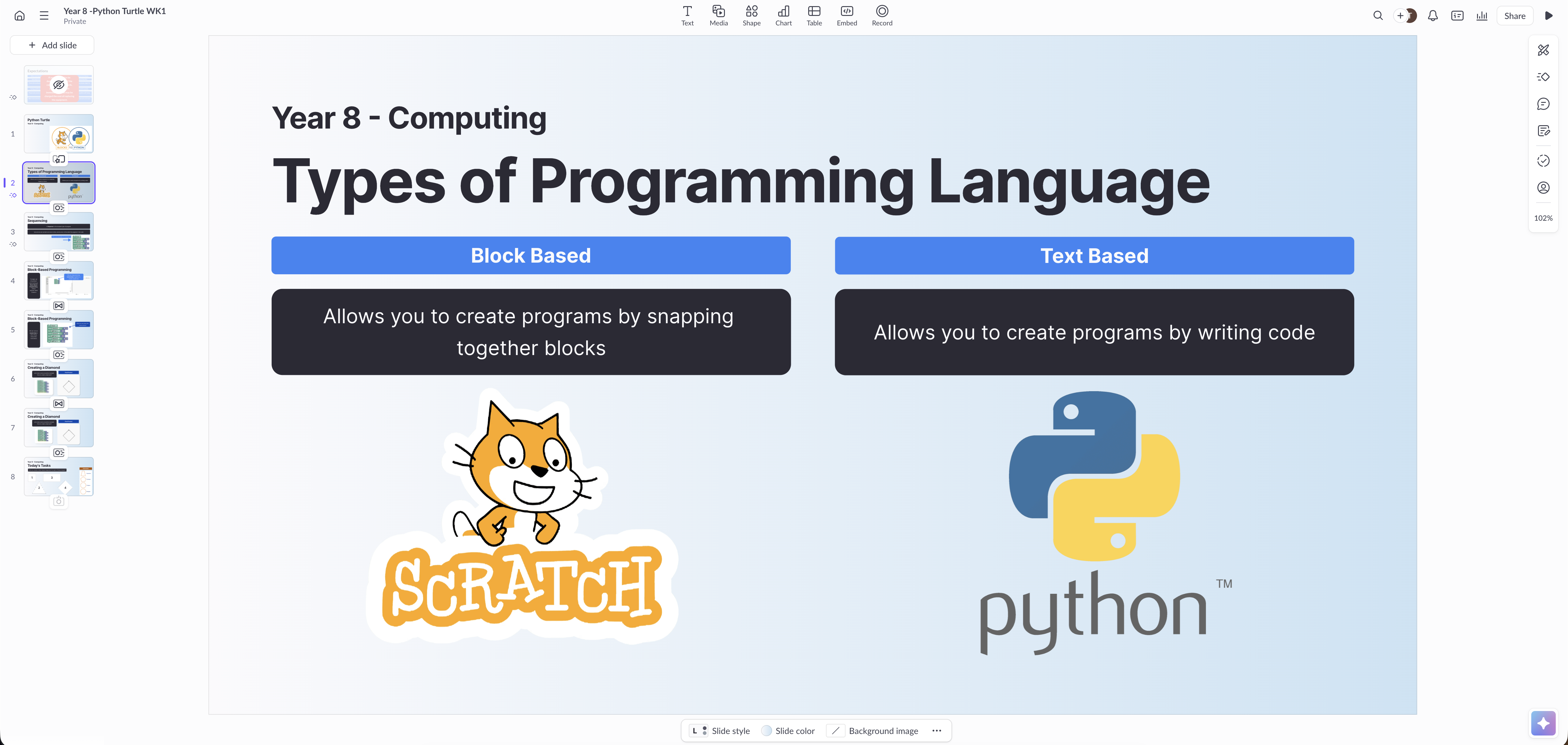
Pitch was allocated to my Year 8 Python Turtle module. It is a wonderfully clean, snappy platform that produces incredibly professional looking slides very quickly. The user interface is modern and intuitive. However, its disadvantage for an educator became obvious quite quickly. The aesthetic and template libraries are heavily geared towards startup pitch decks and business boardrooms. My Year 8s found the resulting presentations slightly dry and corporate. Without built in educational icons or dynamic live delivery tools, I found myself spending far too much time sourcing external images, and diagrams to make the Python code visually interesting.
Prezi
Using Prezi for my Year 11 iMedia class was the most challenging part of the experiment. Its clear advantage is the unique, zooming canvas, which is phenomenal for big picture storytelling and showing how smaller media concepts fit into a broader framework. It certainly breaks the monotony of traditional slides. The major disadvantage is that it demands significant cognitive effort to force into a linear, step by step instructional flow. Trying to map out a rigid sequence for exam preparation on an infinite canvas was highly frustrating, proving that it is perhaps better suited to one off assembly presentations rather than daily, structured lesson delivery.
Adobe Express
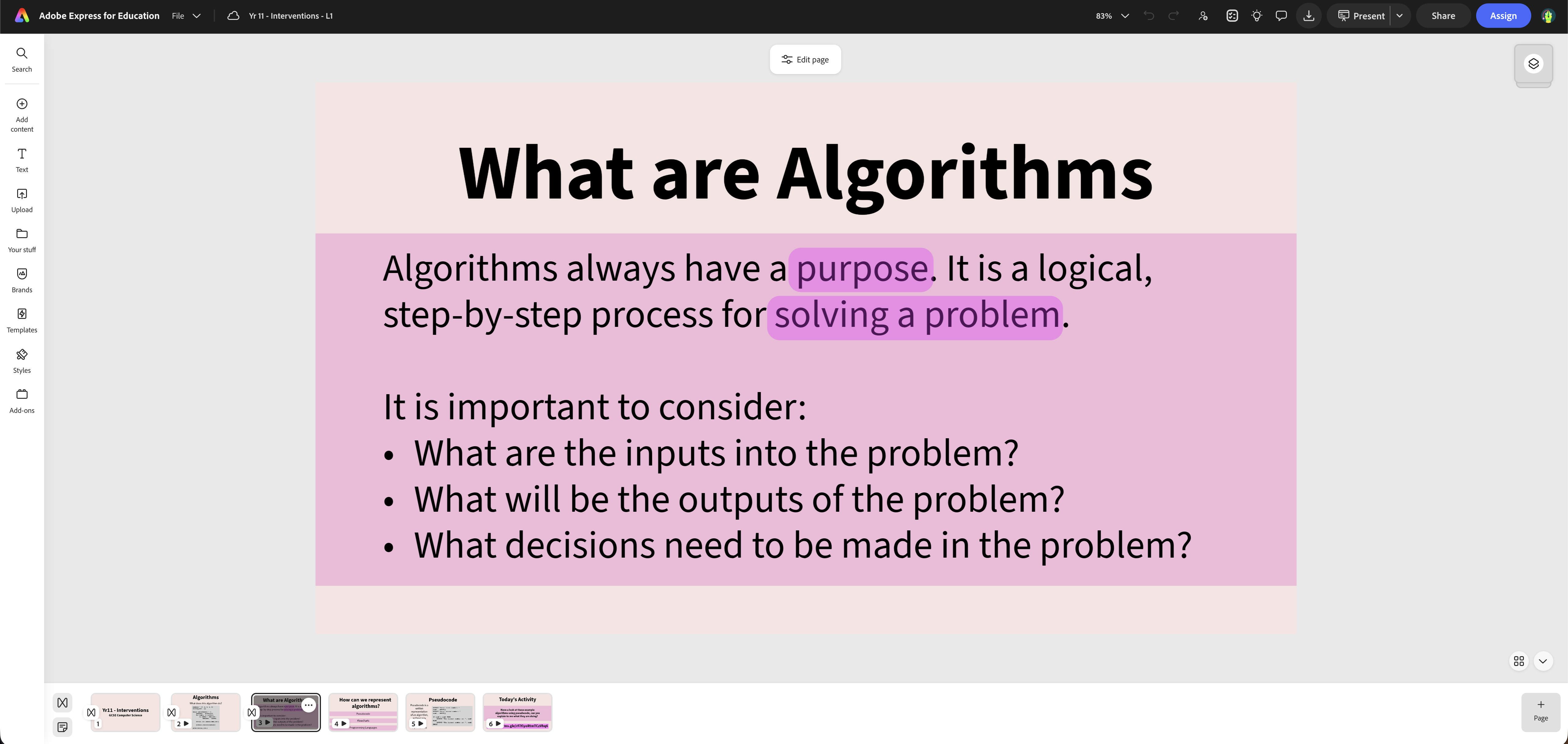
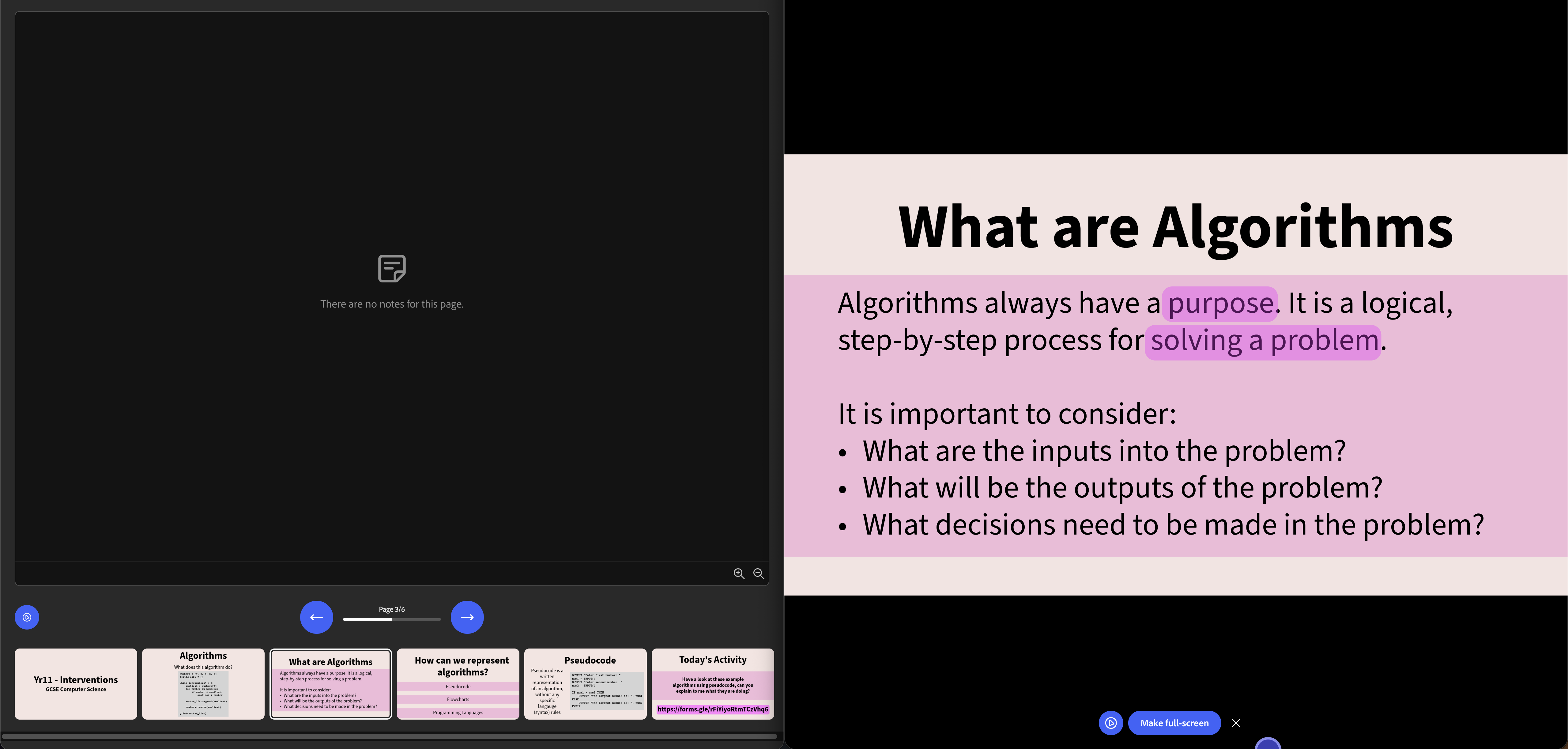
I used Adobe Express to build resources for my Year 11 Faculty Interventions. The distinct advantage here is the brilliant multimedia integration, allowing you to seamlessly pull in graphics and design elements from the wider Adobe ecosystem. It excels at creating visually striking title cards and multimedia collages. The disadvantage is that it operates more as a general graphic design suite than a dedicated, sequential presentation tool. Managing detailed, text heavy slides for intervention theory felt somewhat clunky and disorganised compared to using a purpose built presentation tool.
Data & Results Overview
After six weeks of experimenting, here are the scores based on the evaluation criteria.
Graph (Filters):
Toggle the different tools on and off to filter the graphs.
Making Presentations
| Software | Design | Animations | Morph | Ease | Assets | Importing | Sharing |
|---|---|---|---|---|---|---|---|
| Google Slides | 3 | 4 | No | 4 | No | 5 | 5 |
| Canva | 5 | 5 | Yes | 4 | Yes | 4 | 5 |
| Visme | 4 | 5 | No | 3 | Yes | 3 | 3 |
| Pitch | 3 | 3 | Yes | 4 | No | 3 | 4 |
| Prezi | 3 | 2 | No | 2 | Yes | 3 | 3 |
| Adobe Express | 4 | 3 | No | 3 | Yes | 2 | 4 |
Presenting Presentations
| Software | Speaker View | Speaker Notes | Preview | Drawing | Built-in Timer | Features |
|---|---|---|---|---|---|---|
| Google Slides | Yes | Yes | No | Yes | No | None |
| Canva | Yes | Yes | Yes | Yes | Yes | Live polling, random name picker, magic shortcut animations |
| Visme | Yes | Yes | No | Yes | Yes | Live polling, presenter studio recording |
| Pitch | Yes | Yes | No | Yes | No | Viewer analytics, asynchronous recording |
| Prezi | Yes | Yes | No | Yes | Yes | Video integration on canvas, non-linear zooming |
| Adobe Express | Yes | Yes | No | Yes | No | None |
Conclusion
While several platforms showed initial promise, Canva emerged as the undisputed winner for overall classroom utility. The decision ultimately comes down to practical teaching reality. In education, aesthetics are highly appreciated, but workflow efficiency is paramount.
Speed and Efficiency
As a teacher planning multiple classes, year groups, and topics, I needed a tool that entirely eliminates friction from my planning hours. Canva achieves this by centralising the entire creative process. Instead of spending hours scouring the web for specific educational icons or transparent images, the volume of built-in assets means everything is instantly searchable within the platform. This keeps the focus on lesson sequencing rather than graphic hunting.
Animations and Flow
Canva scored perfectly on design tools and animations. It provides essential modern transitions like Morph, allowing me to smoothly map objects from one slide to the next. This is a phenomenal feature for step-by-step modelling and visually explaining the logical flow of data in computing algorithms, keeping pupil cognitive load perfectly balanced.
Live Delivery
Most importantly, Canva handles the live delivery aspect. A beautiful slide deck is useless if it restricts the teacher to the front desk.
- The Ultimate Presenter Dashboard: The presence of a clear speaker view gives me total control over the lesson's pacing. With integrated notes serving as my hidden scaffolding and a dependable next slide preview, I can transition seamlessly between concepts.
- Built-in Classroom Management: The native, on-screen timer keeps pupils on task during independent work without the clunky need to switch tabs, open separate browser windows, or disrupt the visual flow of the lesson.
- Live Modelling: The absolute standout feature is the ability to push live updates from on-screen drawings. Being able to roam the classroom with a tablet, highlighting code snippets or annotating diagrams in real time, completely transforms a static presentation into a highly interactive, responsive modelling tool.
The Complete Package
Ultimately, Canva consistently supports my pedagogy rather than hindering it. It successfully bridges the gap between efficient, time-saving lesson preparation and dynamic, engaging classroom delivery, making it the definitive, complete package for the modern teacher.
One Year Later ...
Having relied on Canva for every single slide deck throughout the entire 2025-2026 academic year, the experience has been nothing short of brilliant. Over the past twelve months, I have deeply expanded my knowledge of the platform's advanced tools, having established brand templates that has streamlined my daily planning, continually refining and improving the master slide deck template that keeps my resources highly consistent and professional.
The live drawing features have become an absolute staple in my mathematics lessons, allowing me to smoothly annotate complex equations and model problem-solving directly from my tablet.
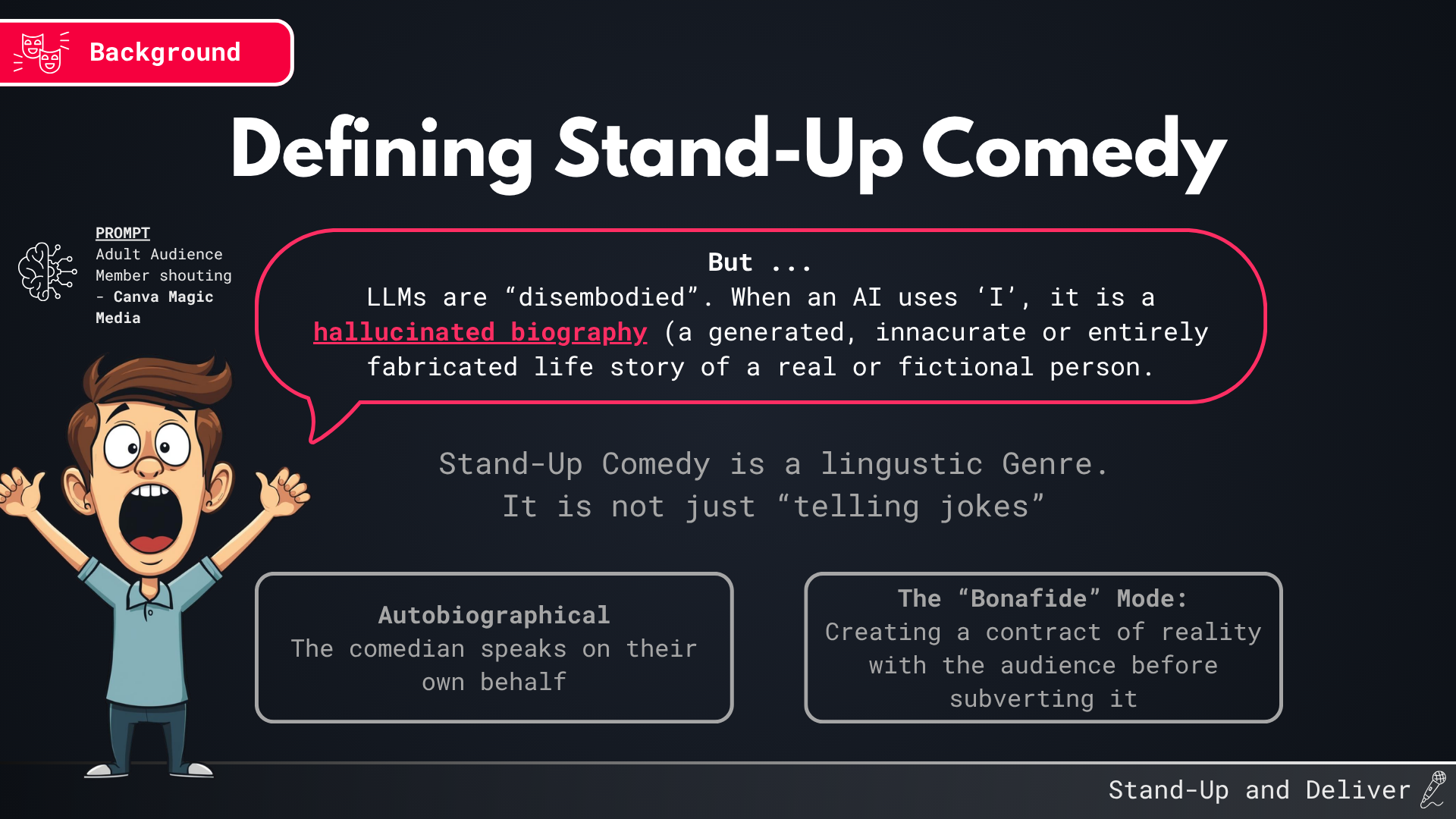
As I've discussed previously in my posts exploring gamification, finding ways to make classroom resources more interactive is something I am incredibly passionate about. Integrating interactive Canva Code resources straight into my presentations has been a game-changer for computing instruction. It allows me to seamlessly embed custom interface widgets and gamified activities directly into the flow of the lesson, keeping pupils engaged without ever needing to switch away to an external tool. This would not have been as seamless without using Canva is my primary presentation tool.
The impact of these tools even extended beyond my school gates. When I delivered a guest lecture at the University of Kent in February 2026, I built the entire presentation using my Canva skills. The design and clarity of the deck received a lot of praise, serving as the validation of the skills I have built over the past year, and the final proof that Canva is the best tool for slide decks in Education.